Table of Contents
In this tutorial you’ll learn how to write performant and type-safe CSS with vanilla-extract (opens in a new tab). The guide will explain how to build a Tailwind UI (opens in a new tab) component from scratch using most currently available vanilla-extract APIs. vanilla-extract has become my go-to CSS solution in any new React project as it combines the strengths of TypeScript and CSS modules, meaning: Best performance on the client but still a more convenient way of writing CSS than plain .css files.
I suspect that vanilla-extract will be very popular in the near future so it’s a great time to learn it now. It also taught me to use and think more about the built-in CSS Custom Properties (commonly known as “CSS Variables”) of CSS. It’s difficult with classic CSS-in-JS solutions (like emotion or styled-components) to get great performance results and with the recent additions to React like streaming and server components they also need to adapt more and more. Zero-runtime solutions like vanilla-extract are future-proof in that regard.
You’ll rebuild a Tailwind UI mockup (opens in a new tab) from scratch. It’ll have support for light & dark mode, and also have two color variants. You can see a live demo (opens in a new tab) and can find the code also on GitHub: vanilla-extract-tutorial (opens in a new tab).
You should have beginner knowledge in CSS and TypeScript as it’ll enable you to navigate easier around the code and understand the CSS itself. The guide won’t focus on the specifics of the CSS itself, but rather how to apply it with vanilla-extract. However, understanding TypeScript syntax and knowing the basics of CSS will really help you.
You’ll use Vite (opens in a new tab) to build the demo site but no prior knowledge is necessary.
vanilla-extract describes itself like this on its website:
Use TypeScript as your preprocessor. Write type‑safe, locally scoped classes, variables and themes, then generate static CSS files at build time.
This also means zero runtime cost! So everything you’ll build today won’t have any performance impacts (at least no negative ones) in the browser. And while you’ll use React in this tutorial, vanilla-extract itself is framework agnostic.
Here’s a short description of what you’ll do:
- Define a CSS reset through global styles.
- Define a theme contract and two themes. In my projects I also always begin with the themes first before doing the actual styling of the app.
- Explanation of the different styling APIs (
style,styleVariants) and external packages (Sprinkles, Recipes). - Summary of what you built.
- Inspiration and more learning resources.
Throughout the tutorial you might feel like this meme:
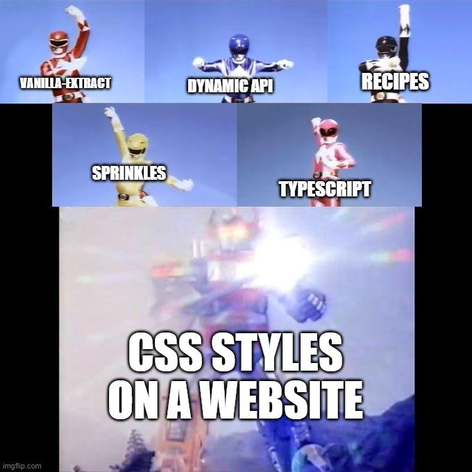
But please keep in mind that I want to showcase most of the APIs. You don’t need to use them all in your project, you can e.g. only stick to style and styleVariants and be super productive with it.
The official docs (opens in a new tab) are also super well written, so I’d recommend having them open in another tab to reference more examples while going through this tutorial.
This guide assumes that you have git, npm, Node.js, and a code editor (e.g. VS Code) installed on your system. If not, you can follow guides on the internet to set up your machine for front-end development.
Clone the tutorial repository (opens in a new tab) to your desired location:
git clone git@github.com:LekoArts/vanilla-extract-tutorial.gitGo into the newly cloned project and checkout the tutorial-start branch:
cd vanilla-extract-tutorialgit checkout tutorial-startInstall the required dependencies:
npm installLastly, check if everything is working by starting the Vite development server:
npm run devThe terminal should print something like:
$ vite
  VITE v3.2.1  ready in 304 ms
  ➜  Local:   http://localhost:5173/  ➜  Network: use --host to expose
Click on the localhost URL to open it in your browser. You should see an unstyled page with content. When the tutorial talks about the browser preview, it refers to this window.
While the consistency of CSS between browsers has greatly improved over the years and CSS resets have faded away more and more, I still do like to use one. More specifically, I’m using Josh Comeau’s CSS reset (opens in a new tab) to set some side-wide defaults. It’s also a good way of introducing the globalStyle (opens in a new tab) API.
With globalStyle you can create styles that are attached to a global selector. It’s kinda like creating a normal .css file that is imported into an app.
vanilla-extract requires you to create every stylesheet as a .css.ts file as otherwise it can’t find your defined styles. Navigate to the src/styles folder and create a new file called global.css.ts. Start with the following contents:
import { globalStyle } from "@vanilla-extract/css"
globalStyle(`*`, {  boxSizing: `border-box`,  margin: 0,})
vanilla-extract’s styling APIs are all named imports from @vanilla-extract/css. The first parameter of globalStyle is a selector string, the second parameter a style object. So the above example will be compiled to the following CSS:
* { box-sizing: border-box; margin: 0;}The globalStyle API can also be used to add styles depending on other scoped class names. For example:
import { globalStyle, style } from "@vanilla-extract/css"
export const parentClass = style({})
globalStyle(`${parentClass} > a`, { boxSizing: `border-box`, margin: 0,})Please note, that you can’t use complex selectors (opens in a new tab) (using the selectors key) or pseudo selectors inside globalStyle. So this here won’t work:
globalStyle(`h1`, { selectors: { `&:hover`: { color: `red` } }, ":hover": { color: `red` }})Add the rest of the necessary styles to the file:
import { globalStyle } from "@vanilla-extract/css"
globalStyle(`*`, {  boxSizing: `border-box`,  margin: 0,})
globalStyle(`html, body`, {  height: `100%`,})
globalStyle(`body`, {  lineHeight: 1.5,  WebkitFontSmoothing: `antialiased`,})
globalStyle(`img, picture, video, canvas, svg`, {  display: `block`,  maxWidth: `100%`,})
globalStyle(`input, button, textarea, select`, {  font: `inherit`,})
globalStyle(`p, h1, h2, h3, h4, h5, h6`, {  overflowWrap: `break-word`,})
globalStyle(`#root`, {  isolation: `isolate`,})
In order for these styles to be picked up you’ll need to import the global.css.ts file into one of your app files, e.g. src/components/app.tsx. Add the import:
import * as React from "react"import { Stats, StatsItem } from "./stats"import { useColorScheme } from "../hooks/use-color-scheme"import "../styles/global.css"
// Rest of app.tsx
In case you’re wondering why the import is global.css and not global.css.ts: Vite automatically handles the file extension like the other files.
You should now see slightly changed styles in your browser window.
You might be wondering why so early in this tutorial the topic of theming is discussed already. It’s because I think that starting out your app design with a defined design system is the best way to write consistent and maintainable CSS. And because it’s a hassle to switch out individual CSS styles with design tokes after the fact, you’ll now learn how to use vanilla-extract’s theming APIs.
The createTheme (opens in a new tab) and createThemeContract (opens in a new tab) APIs are not only valuable when defining multiple themes, it’s perfectly fine to also use it for just one theme. If you then later decide to add a new theme everything will already be set up.
Start by creating a new file inside the src/styles directory called themes.css.ts. As a start, it’ll contain the necessary imports from @vanilla-extract/css and some design tokens. You can take the design tokens from anywhere, in this instance I used parts of the Tailwind CSS color palette for the colors.
import { createThemeContract, createTheme } from "@vanilla-extract/css"
const SYSTEM_FONT_STACK = `-apple-system, BlinkMacSystemFont, "Segoe UI", Roboto,Helvetica, Arial, sans-serif, "Apple Color Emoji", "Segoe UI Emoji", "Segoe UI Symbol"`
export const colors = {  black: `#000`,  white: `#fff`,  gray50: `#f9fafb`,  gray100: `#f3f4f6`,  gray200: `#e5e7eb`,  gray300: `#d1d5db`,  gray400: `#9ca3af`,  gray500: `#6b7280`,  gray600: `#4b5563`,  gray700: `#374151`,  gray800: `#1f2937`,  gray900: `#111827`,  red50: `#fef2f2`,  red100: `#fee2e2`,  red200: `#fecaca`,  red300: `#fca5a5`,  red400: `#f87171`,  red500: `#ef4444`,  red600: `#dc2626`,  red700: `#b91c1c`,  red800: `#991b1b`,  red900: `#7f1d1d`,  green50: `#f0fdf4`,  green100: `#dcfce7`,  green200: `#bbf7d0`,  green300: `#86efac`,  green400: `#4ade80`,  green500: `#22c55e`,  green600: `#16a34a`,  green700: `#15803d`,  green800: `#166534`,  green900: `#14532d`,  blue50: `#eff6ff`,  blue100: `#dbeafe`,  blue200: `#bfdbfe`,  blue300: `#93c5fd`,  blue400: `#60a5fa`,  blue500: `#3b82f6`,  blue600: `#2563eb`,  blue700: `#1d4ed8`,  blue800: `#1e40af`,  blue900: `#1e3a8a`,}
export const breakpoints = {  mobile: 0,  tablet: 768,  desktop: 1200,}
As you can see this file also defines a system font stack (opens in a new tab) and breakpoints. The latter will be used later for CSS media queries. These constants don’t have to be in this file, you could import these things also from other separate files.
One important note about the colors: They all have to be flat, you can’t nest them, e.g. blue: { 100: '#dbeafe' }. That’s why the colors are defined as blue100.
For the sake of keeping code block examples short I’ll omit these design tokens in the following examples. They still exist though!
Before creating your light and dark themes you should set up a contract that defines which properties each theme should have. Otherwise you could end up in a situation where one theme has a certain property, and the other one not. As an example:
const light = {  button: `some-value`,}const dark = {}
const cssStyle = isDark ? dark.button : light.button
When isDark is truthy, this will fail as dark.button doesn’t exist. With createThemeContract you can enforce that things like these won’t happen.
When creating the contract the values of the input are ignored so you can pass in an empty string, null or real values. Add the following to your themes.css.ts file:
55 collapsed lines
import { createThemeContract, createTheme } from "@vanilla-extract/css"
const SYSTEM_FONT_STACK = `-apple-system, BlinkMacSystemFont, "Segoe UI", Roboto,Helvetica, Arial, sans-serif, "Apple Color Emoji", "Segoe UI Emoji", "Segoe UI Symbol"`
export const colors = { black: `#000`, white: `#fff`, gray50: `#f9fafb`, gray100: `#f3f4f6`, gray200: `#e5e7eb`, gray300: `#d1d5db`, gray400: `#9ca3af`, gray500: `#6b7280`, gray600: `#4b5563`, gray700: `#374151`, gray800: `#1f2937`, gray900: `#111827`, red50: `#fef2f2`, red100: `#fee2e2`, red200: `#fecaca`, red300: `#fca5a5`, red400: `#f87171`, red500: `#ef4444`, red600: `#dc2626`, red700: `#b91c1c`, red800: `#991b1b`, red900: `#7f1d1d`, green50: `#f0fdf4`, green100: `#dcfce7`, green200: `#bbf7d0`, green300: `#86efac`, green400: `#4ade80`, green500: `#22c55e`, green600: `#16a34a`, green700: `#15803d`, green800: `#166534`, green900: `#14532d`, blue50: `#eff6ff`, blue100: `#dbeafe`, blue200: `#bfdbfe`, blue300: `#93c5fd`, blue400: `#60a5fa`, blue500: `#3b82f6`, blue600: `#2563eb`, blue700: `#1d4ed8`, blue800: `#1e40af`, blue900: `#1e3a8a`,}
export const breakpoints = { mobile: 0, tablet: 768, desktop: 1200,}
export const vars = createThemeContract({ colors: { primary: ``, body: ``, background: ``, link: ``, linkHover: ``, ...colors, }, font: { body: ``, }, fontSize: { xs: ``, sm: ``, md: ``, lg: ``, xl: ``, }, space: { xs: ``, sm: ``, md: ``, lg: ``, xl: ``, }, boxShadow: { sm: ``, md: ``, lg: ``, }, radii: { sm: ``, md: ``, full: ``, },})You have done two things now:
- You defined a theme contract that other themes (created with
createTheme) can implement. Each theme now has to have these keys. - You have declared a
varsvariable that can be used in other vanilla-extract stylesheets to reference design tokens. Depending on which theme currently is active the correct values are automatically used.
Now that you have a theme contract, it’s time to define your light and dark themes. For the sake of this tutorial they are both defined in themes.css.ts but in production usage I’d advise to place each theme into its own file (for better tree-shaking).
createTheme creates a locally scoped class name and a theme contract. But since the contract already exists, you’ll only use the class name (for more information on the latter, you can read the createTheme docs (opens in a new tab)).
Edit your themes.css.ts:
93 collapsed lines
import { createThemeContract, createTheme } from "@vanilla-extract/css"
const SYSTEM_FONT_STACK = `-apple-system, BlinkMacSystemFont, "Segoe UI", Roboto,Helvetica, Arial, sans-serif, "Apple Color Emoji", "Segoe UI Emoji", "Segoe UI Symbol"`
export const colors = { black: `#000`, white: `#fff`, gray50: `#f9fafb`, gray100: `#f3f4f6`, gray200: `#e5e7eb`, gray300: `#d1d5db`, gray400: `#9ca3af`, gray500: `#6b7280`, gray600: `#4b5563`, gray700: `#374151`, gray800: `#1f2937`, gray900: `#111827`, red50: `#fef2f2`, red100: `#fee2e2`, red200: `#fecaca`, red300: `#fca5a5`, red400: `#f87171`, red500: `#ef4444`, red600: `#dc2626`, red700: `#b91c1c`, red800: `#991b1b`, red900: `#7f1d1d`, green50: `#f0fdf4`, green100: `#dcfce7`, green200: `#bbf7d0`, green300: `#86efac`, green400: `#4ade80`, green500: `#22c55e`, green600: `#16a34a`, green700: `#15803d`, green800: `#166534`, green900: `#14532d`, blue50: `#eff6ff`, blue100: `#dbeafe`, blue200: `#bfdbfe`, blue300: `#93c5fd`, blue400: `#60a5fa`, blue500: `#3b82f6`, blue600: `#2563eb`, blue700: `#1d4ed8`, blue800: `#1e40af`, blue900: `#1e3a8a`,}
export const breakpoints = { mobile: 0, tablet: 768, desktop: 1200,}
export const vars = createThemeContract({ colors: { primary: ``, body: ``, background: ``, link: ``, linkHover: ``, ...colors, }, font: { body: ``, }, fontSize: { xs: ``, sm: ``, md: ``, lg: ``, xl: ``, }, space: { xs: ``, sm: ``, md: ``, lg: ``, xl: ``, }, boxShadow: { sm: ``, md: ``, lg: ``, }, radii: { sm: ``, md: ``, full: ``, },})
export const lightThemeClass = createTheme(vars, { colors: { primary: colors.blue500, body: colors.gray700, background: colors.gray100, link: colors.blue800, linkHover: colors.blue600, ...colors, },})
export const darkThemeClass = createTheme(vars, { colors: { primary: colors.blue400, body: colors.gray300, background: colors.gray800, link: colors.blue200, linkHover: colors.blue400, ...colors, },})TypeScript should now yell at you, saying something like No overload matches this call.. Why is that? It’s because your light and dark themes are missing properties! So far you only defined the colors but the theme contract enforces all the other properties, too.
Of course, you could now manually write out the missing CSS for each theme, but if it doesn’t change between themes then it makes sense to put that into its own variable. Add a commonVars to the file:
93 collapsed lines
import { createThemeContract, createTheme } from "@vanilla-extract/css"
const SYSTEM_FONT_STACK = `-apple-system, BlinkMacSystemFont, "Segoe UI", Roboto,Helvetica, Arial, sans-serif, "Apple Color Emoji", "Segoe UI Emoji", "Segoe UI Symbol"`
export const colors = { black: `#000`, white: `#fff`, gray50: `#f9fafb`, gray100: `#f3f4f6`, gray200: `#e5e7eb`, gray300: `#d1d5db`, gray400: `#9ca3af`, gray500: `#6b7280`, gray600: `#4b5563`, gray700: `#374151`, gray800: `#1f2937`, gray900: `#111827`, red50: `#fef2f2`, red100: `#fee2e2`, red200: `#fecaca`, red300: `#fca5a5`, red400: `#f87171`, red500: `#ef4444`, red600: `#dc2626`, red700: `#b91c1c`, red800: `#991b1b`, red900: `#7f1d1d`, green50: `#f0fdf4`, green100: `#dcfce7`, green200: `#bbf7d0`, green300: `#86efac`, green400: `#4ade80`, green500: `#22c55e`, green600: `#16a34a`, green700: `#15803d`, green800: `#166534`, green900: `#14532d`, blue50: `#eff6ff`, blue100: `#dbeafe`, blue200: `#bfdbfe`, blue300: `#93c5fd`, blue400: `#60a5fa`, blue500: `#3b82f6`, blue600: `#2563eb`, blue700: `#1d4ed8`, blue800: `#1e40af`, blue900: `#1e3a8a`,}
export const breakpoints = { mobile: 0, tablet: 768, desktop: 1200,}
export const vars = createThemeContract({ colors: { primary: ``, body: ``, background: ``, link: ``, linkHover: ``, ...colors, }, font: { body: ``, }, fontSize: { xs: ``, sm: ``, md: ``, lg: ``, xl: ``, }, space: { xs: ``, sm: ``, md: ``, lg: ``, xl: ``, }, boxShadow: { sm: ``, md: ``, lg: ``, }, radii: { sm: ``, md: ``, full: ``, },})
const commonVars = { font: { body: SYSTEM_FONT_STACK, }, space: { xs: `0.25rem`, sm: `0.5rem`, md: `1rem`, lg: `1.5rem`, xl: `2.5rem`, }, fontSize: { xs: `0.8rem`, sm: `0.875rem`, md: `1rem`, lg: `1.25rem`, xl: `1.5rem`, }, boxShadow: { sm: `0 1px 2px 0 rgb(0 0 0 / 0.05)`, md: `0 4px 6px -1px rgb(0 0 0 / 0.1), 0 2px 4px -2px rgb(0 0 0 / 0.1)`, lg: `0 10px 15px -3px rgb(0 0 0 / 0.1), 0 4px 6px -4px rgb(0 0 0 / 0.1)`, }, radii: { sm: `0.2rem`, md: `0.4rem`, full: `100%`, },}
21 collapsed lines
export const lightThemeClass = createTheme(vars, { colors: { primary: colors.blue500, body: colors.gray700, background: colors.gray100, link: colors.blue800, linkHover: colors.blue600, ...colors, },})
export const darkThemeClass = createTheme(vars, { colors: { primary: colors.blue400, body: colors.gray300, background: colors.gray800, link: colors.blue200, linkHover: colors.blue400, ...colors, },})You can now spread that object into each theme and the compiler should be happy:
export const lightThemeClass = createTheme(vars, {  colors: {    primary: colors.blue500,    body: colors.gray700,    background: colors.gray100,    link: colors.blue800,    linkHover: colors.blue600,    ...colors,  },  ...commonVars,})
export const darkThemeClass = createTheme(vars, {  colors: {    primary: colors.blue400,    body: colors.gray300,    background: colors.gray800,    link: colors.blue200,    linkHover: colors.blue400,    ...colors,  },  ...commonVars,})
Congrats, you successfully created a light and dark theme using a theme contract.
Pro Tip: Using Open Props
Some food for thought: You could use Open Props (opens in a new tab) together with vanilla-extract. You can use it in your themes or directly in the styles of a component.
import { style, createVar } from "@vanilla-extract/css"import OPColors from "open-props/src/colors"
export const colors = OPColorsimport { style, createVar } from "@vanilla-extract/css"import OP from "open-props"
export const accentVar = createVar()export const onAccent = createVar()
export const button = style({ vars: { [accentVar]: OP.indigo7, [onAccent]: OP.indigo0, }, backgroundColor: accentVar, color: onAccent, padding: `${OP.size4} ${OP.size8}`, borderRadius: OP.radius2, border: "none", ":hover": { vars: { [accentVar]: OP.indigo8, [onAccent]: "white", }, },})It doesn’t have to be Open Props of course, feel free to use other libraries like Tailwind!
Now that you have lightThemeClass and darkThemeClass available as variables, you need to apply the class names to a DOM element. You’ll add it to the outermost wrapper of the app. However, by being able to place it everywhere you want to could theoretically create powerful combinations of locally scoped CSS, so use multiple themes simultaneously on the same page.
Open src/components/app.tsx, import both class names and adjust schemeClass with its values:
import * as React from "react"import { lightThemeClass, darkThemeClass } from "../styles/themes.css"import { Stats, StatsItem } from "./stats"import { useColorScheme } from "../hooks/use-color-scheme"import "../styles/global.css"
const App: React.FC = () => {  const scheme = useColorScheme()  const schemeClass = scheme === `dark` ? darkThemeClass : lightThemeClass  const [variant, setVariant] = React.useState<"default" | "invert">(`default`)
  // Rest of component...
If you use your browser’s developer tools (Right click => Inspect element) to look at the HTML, you should now see a <div> with a class name like themes_lightThemeClass__h8kum61s (or themes_darkThemeClass__h8kum61t during dark mode - the hash at the end will probably not match with yours, which is fine). The <div> defines CSS custom properties:
.themes_lightThemeClass__h8kum61s { --colors-background__h8kum62: #f3f4f6; /* etc. */}In the next step you’ll be using the exported vars variable. When accessing those properties, you’ll behind the scenes use CSS custom properties that are defined in .themes_lightThemeClass__h8kum61s. How cool is that?!
After setting up a lot of boilerplate, it’s now finally time to write some CSS for the actual app! If you have used CSS modules in the past, the style API will make you feel right at home. In this part you’ll learn how to use style (opens in a new tab) and styleVariants (opens in a new tab) to style the <App> component.
style creates a style rule with a locally scoped class name which you then can directly import into your component. styleVariants creates a collection of style rules, really useful when mapping component props to styles, e.g. <button className={styles.background[props.variant]}>.
Why I love styleVariants ❤️
styleVariants is probably my favourite vanilla-extract API. You can easily style your whole app only with style and styleVariants. In my personal site I often use styleVariants for components that have different variants, e.g. an <Alert> component. I think it’s a really clear and easy to understand API that maps directly to the React component it is used in. You can also share TypeScript types.
Here’s an example of an <Alert> component with multiple variants. Depending on the variant it should have a different background. In addition, there should also be variants for both light and dark theme. Ask yourself the question, how would you currently solve this problem in your app or at work?
The vanilla-extract stylesheet:
import {  createVar,  style,  StyleRule,  styleVariants,} from "@vanilla-extract/css"import { themesSelectors } from "../../styles/atoms.css"import { vars } from "../../styles/themes/contract.css"import { colorPalette } from "../../styles/tokens/colors"
export type AlertStatus = "info" | "warning" | "error" | "success"
const bgVar = createVar()
const alertBaseStyle = style({  vars: {    [bgVar]: vars.color.bg,  },  background: bgVar,})
const colorMap = {  info: `blue`,  warning: `orange`,} as const
const darkBg = 200const bg = 100
const alerts: Record<AlertStatus, StyleRule> = {  info: {    vars: {      [bgVar]: colorPalette[colorMap.info][bg],    },    selectors: {      [themesSelectors.dark]: {        vars: {          [bgVar]: colorPalette[colorMap.info][darkBg],        },      },    },  },  warning: {    vars: {      [bgVar]: colorPalette[colorMap.warning][bg],    },    selectors: {      [themesSelectors.dark]: {        vars: {          [bgVar]: colorPalette[colorMap.warning][darkBg],        },      },    },  },}
export const alertVariants = styleVariants(alerts, (alert) => [  alertBaseStyle,  alert,])
The base style defines the bgVar CSS variable and assigns it to background. Then, depending on the AlertStatus, the CSS variable is overridden. The selectors key is used to handle the dark mode case. How it’s used in the React component:
import { AlertStatus, alertVariants } from "./alert.css"
interface IAlertProps {  title: string  status: AlertStatus}
export const Alert: React.FC<React.PropsWithChildren<IAlertProps>> = ({ status, children,}) => <div className={alertVariants[status]}>{children}</div>Create a new vanilla-extract stylesheet called app.css.ts but this time inside src/components:
import { style } from "@vanilla-extract/css"import { vars } from "../styles/themes.css"
export const wrapper = style({})
You can define CSS rules by passing an array of class names and/or style objects to style. CSS Variables, simple pseudo elements, selectors, and media/feature queries are also supported (refer to the style docs (opens in a new tab) for more information). By exporting wrapper you have access to its class name and can use it inside your React component.
As said above, style not only accepts a style object, but also an array of class names. Or in other words: You can use other style definitions in style.
// Behind the scenes this generates a class nameconst base = style({ padding: 12 })
// This is an array of class names & style objectsconst wrapper = style([base, { background: `blue` }])
Switch to the <App> component and import the newly created style. You can either use named imports or use a splat import. The latter will be used here:
import * as React from "react"import { lightThemeClass, darkThemeClass } from "../styles/themes.css"import { Stats, StatsItem } from "./stats"import { useColorScheme } from "../hooks/use-color-scheme"import * as styles from "./app.css"import "../styles/global.css"
// Rest of app.tsx
Next, add the styles.wrapper class name to the wrapper component (currently <div className={schemeClass}>). But this component already has a class name defined… You’ll need to apply multiple ones at the same time.
I’d recommend using clsx (opens in a new tab) in production, for the sake of this tutorial you’ll be using .join(' ').
return ( <div className={[schemeClass, styles.wrapper].join(` `)}> <main>If you look at your browser, nothing should have changed just yet as the style rule is still empty. Switch back to app.css.ts and apply the following:
import { style } from "@vanilla-extract/css"import { vars } from "../styles/themes.css"
export const wrapper = style({  fontFamily: vars.font.body,  backgroundColor: vars.colors.background,  color: vars.colors.body,  height: `100vh`,  width: `100%`,  display: `flex`,  justifyContent: `center`,  alignItems: `center`,  fontSize: vars.fontSize.md,})
You’re using the vars from your previously created theme contract now. You can inspect the HTML and CSS with your browser’s developer tools to understand better what’s going on. In the previous step you added themes_lightThemeClass__someHash to your outer most wrapper. The CSS class defined CSS variables. Your now newly created wrapper class uses these CSS variables:
.themes_lightThemeClass__h8kum61s {  --colors-background__h8kum62: #f3f4f6;  /* etc. */}
.app_wrapper__2ibns60 {  background-color: var(--colors-background__h8kum62);  /* etc. */}
Add other style definitions to app.css.ts:
export const innerWrapper = style({  maxWidth: `1200px`,  width: `100%`,  padding: vars.space.lg,})
export const topBar = style({  display: `flex`,  justifyContent: `space-between`,  alignItems: `center`,  marginBottom: vars.space.lg,})
export const button = style({  border: `none`,  background: `none`,  color: vars.colors.link,  borderWidth: `1px`,  borderStyle: `solid`,  borderColor: `transparent`,  transition: `all 0.3s ease-in-out`,  borderRadius: vars.radii.sm,  paddingLeft: vars.space.sm,  paddingRight: vars.space.sm,  selectors: {    "&:hover": {      color: vars.colors.linkHover,      cursor: `pointer`,      borderColor: vars.colors.linkHover,    },  },})
The button uses the selectors key to add :hover styles. You have to use the &, otherwise vanilla-extract will complain. You can also use other pseudo classes like :focus or :active.
Add the CSS classes to app.tsx:
return ( <div className={[schemeClass, styles.wrapper].join(` `)}> <main className={styles.innerWrapper}> <div className={styles.topBar}> <div>Last 30 Days</div> <button type="button" className={styles.button} onClick={() => (variant === `default` ? setVariant(`invert`) : setVariant(`default`))} > Toggle Variant </button> </div>When visiting the browser preview, you should now already see “Last 30 Days” on the very left, and a styled “Toggle Variant” button the right.
You named the vanilla-extract stylesheet for the app.tsx component app.css.ts and placed it as a sibling to the React component. This shows my recommended way of creating vanilla-extract stylesheets. When looking at a React component you can more easily find the associated CSS for it as it’s a direct sibling and through file search you can look for <component-name>.css.ts.
In the next step you’ll be using styleVariants to style the heading in the topBar and the footer depending on light and dark theme. Add the styleVariants import to app.css.ts and add the following:
import { style, styleVariants } from "@vanilla-extract/css"import { vars } from "../styles/themes.css"// Rest of styles...
const topBarHeadingBase = style({  fontSize: vars.fontSize.lg,  fontWeight: 700,})
export const topBarHeading = styleVariants({  light: [topBarHeadingBase, { color: `black` }],  dark: [topBarHeadingBase, { color: `white` }],})
const footerBase = style({  fontSize: vars.fontSize.sm,  textAlign: `center`,  marginTop: vars.space.xl,})
const footerColors = {  light: vars.colors.gray600,  dark: vars.colors.gray400,}
export const footer = styleVariants(footerColors, (color) => [  footerBase,  { color },])
A lot is going on here, so let’s unpack it.
- You can use
styleVariantsin two different forms. Either provide only one function parameter (an object) or define two function parameters (an object and a mapping function). - You can use style composition (opens in a new tab) to more easily re-use styles. In this example you’re re-using
topBarHeadingBaseandfooterBaseto apply to both variants (light and dark). - You can define style rules not only as an style object but also as an array of class names and/or style objects (see
[topBarHeadingBase, { color: 'black' }]or[footerBase, { color }]).
You’ll probably most often use styleVariants with a mapping function, at least that’s for me the case. You can of course also use nested properties for different style variants, for example:
const footerStyles = {  light: {    color: `black`,    background: `white`,  },  dark: {    color: `white`,    background: `dark`,  },}
export const footer = styleVariants(footerStyles, (style) => style)
Add the styles to <App>:
import * as React from "react"import { lightThemeClass, darkThemeClass } from "../styles/themes.css"import { Stats, StatsItem } from "./stats"import { useColorScheme } from "../hooks/use-color-scheme"import * as styles from "./app.css"import "../styles/global.css"
const App: React.FC = () => { const scheme = useColorScheme() const schemeClass = scheme === `dark` ? darkThemeClass : lightThemeClass const [variant, setVariant] = React.useState<"default" | "invert">(`default`)
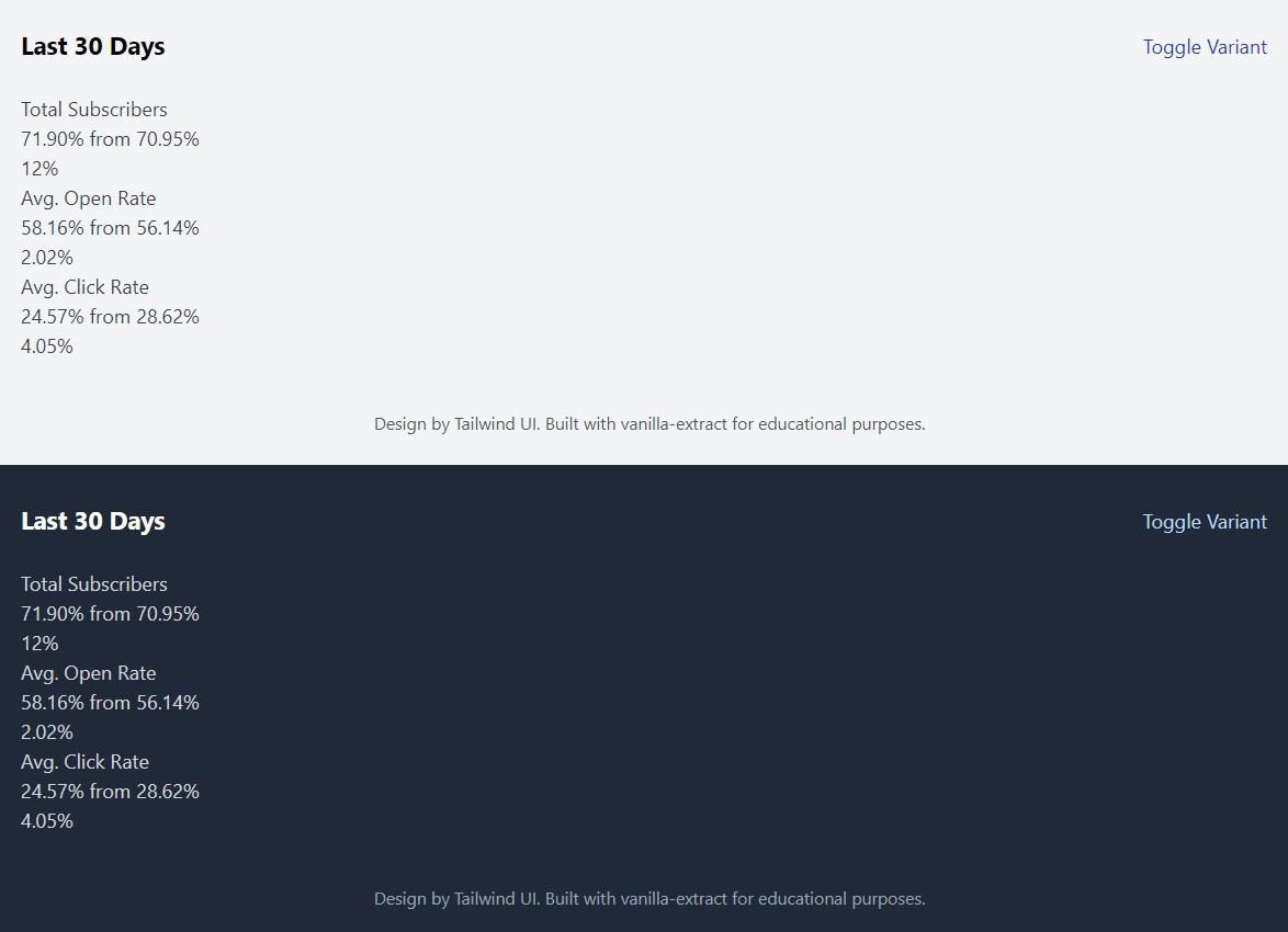
return ( <div className={[schemeClass, styles.wrapper].join(` `)}> <main className={styles.innerWrapper}> <div className={styles.topBar}> <div className={styles.topBarHeading[scheme]}>Last 30 Days</div> <button type="button" className={styles.button} onClick={() => variant === `default` ? setVariant(`invert`) : setVariant(`default`) } > Toggle Variant </button> </div> <Stats variant={variant}> <StatsItem label="Total Subscribers" from={70.946} to={71.897} percentage={12} /> <StatsItem label="Avg. Open Rate" from={56.14} to={58.16} percentage={2.02} /> <StatsItem label="Avg. Click Rate" from={28.62} to={24.57} percentage={-4.05} /> </Stats> <div className={styles.footer[scheme]}> Design by Tailwind UI. Built with vanilla-extract for educational purposes. </div> </main> </div> )}
export default AppCongrats, you successfully styled the <App> component! Your page should now look like this (light mode at the top & dark mode at the bottom):
So far I’ve shown vanilla-extract APIs that are part of @vanilla-extract/css, it’s kind of the “core” package of vanilla-extract. But the authors also offer additional packages that you can use. The first one you’ll use and learn is Sprinkles.
Sprinkles (opens in a new tab) generates a static set of custom utility classes that you can use throughout your app. With Sprinkles you can build your own zero-runtime, type-safe version of Tailwind (opens in a new tab) or Styled System (opens in a new tab).
Tailwind to Sprinkles Comparisons
Here’s how you would write Tailwind-like utility classes with Sprinkles:
<main class="text-xl max-w-xl p-4">Hello World</main>import { sprinkles as s } from "./sprinkles.css"
const Page = () => ( <main className={s({ fontSize: `xl`, maxWidth: `xl`, p: 4 })}> Hello World </main>)Tailwind supports responsive design and dark mode but with the right configuration Sprinkles can do that, too!
<main class="w-16 sm:w-32 text-center sm:text-left bg-white dark:bg-slate-800"> Hello World</main>import { sprinkles as s } from "./sprinkles.css"
// You can use object notation or array notation for conditionsconst Page = () => ( <main className={s({ width: { default: 16, sm: 32 }, textAlign: [`center`, `left`], background: { light: `white`, dark: `bgSlate800` }, })} > Hello World </main>)I hope these examples clicked for you and you can understand the immediate value that Sprinkles can offer. The Sprinkles version might seem more verbose but you can create your own <Box> component to mitigate that. At the end of this section you’ll learn more about that.
Without further ado, let’s add Sprinkles to your design ✨
Inside the src/styles folder, create a new file called sprinkles.css.ts and import the necessary functions and constants:
import { createSprinkles, defineProperties } from "@vanilla-extract/sprinkles"import { breakpoints, vars } from "./themes.css"
const { space, colors, fontSize, radii, boxShadow } = vars
@vanilla-extract/sprinkles exports a couple of functions and TypeScript types, however the two most important functions you’ll use are:
defineProperties: Let’s you create a collection of utility classes with properties, conditions, and shorthands. You can usedefinePropertiesmultiple times to define collections scoped to different properties (e.g. some have media queries, other light/dark mode).createSprinkles: Enables you to create a type-safe function to access your defined properties. You can provide one or more collections defined bydefineProperties.
Start by adding unresponsive properties to the file. This showcases the most basic form of using defineProperties as you only provide properties:
// Imports...
const unresponsiveProperties = defineProperties({  properties: {    fontSize,    lineHeight: fontSize,    textAlign: [`center`, `left`, `right`],    textTransform: [`lowercase`, `uppercase`],    fontWeight: [400, 500, 600, 700, 800],    textDecoration: [`none`, `underline`],    borderRadius: radii,    boxShadow,  },})
We don’t need these properties to have conditions on e.g. screen size or light/dark mode. They don’t need to change when these things change.
You can define properties as an array, as an object, or use vanilla-extract themes.
import { defineProperties } from "@vanilla-extract/sprinkles"import { vars } from "./themes.css"
/*vars.radii is an object like { md: '0.2rem', full: '100%' }*/
const propertiesDemo = defineProperties({  properties: {    // Mapping of valid CSS values    textAlign: [`center`, `left`, `right`],    // key-value mapping object    fontWeight: {      normal: 400,      medium: 500,    },    // Using vanilla-extract themes    borderRadius: vars.radii,  },})
Next, define properties that rely on colors. Remember the big colors object you defined earlier in themes.css.ts? It’ll be used now for color, background, and borderColor:
// Imports and unresponsiveProperties...
const colorProperties = defineProperties({  conditions: {    light: {      "@media": `(prefers-color-scheme: light)`,    },    dark: { "@media": `(prefers-color-scheme: dark)` },    hover: { selector: `&:hover` },    focus: { selector: `&:focus` },  },  properties: {    color: colors,    background: colors,    borderColor: colors,  },})
This snippet showcases how to provide conditions for said properties. conditions can be a media, feature, or container query or a selector. The light and dark conditions are met when the media query is truthy. The hover and focus conditions are met when the DOM element is in the :hover or :focus state.
TypeScript should complain to you that a property is missing. And yes, it is! You need to define a defaultCondition. Most often you want to define values that are non-conditional when using Sprinkles, e.g. sprinkles({ color: 'black' }). Add it to your colorProperties:
// Imports and unresponsiveProperties...
const colorProperties = defineProperties({  conditions: {    light: {      "@media": `(prefers-color-scheme: light)`,    },    dark: { "@media": `(prefers-color-scheme: dark)` },    hover: { selector: `&:hover` },    focus: { selector: `&:focus` },  },  defaultCondition: [`light`, `dark`],  properties: {    color: colors,    background: colors,    borderColor: colors,  },})
defaultCondition can be a single condition or an array of conditions. You’ll see this in just a bit again when you’ll learn about the responsive properties. In this instance the conditions are mutually exclusive (light and dark mode can’t be met at the same time) so you need to define both as a defaultCondition.
TypeScript should be happy now and the code sprinkles({ color: 'black' }) automatically evaluates to sprinkles({ color: { light: 'black', dark: 'black' }}).
The last defineProperties call will add properties that should be responsive to CSS media queries. Add it to your sprinkles.css.ts file:
// Imports, unresponsiveProperties, colorProperties...
function transformBreakpoints<Output>(input: Record<string, any>) {  let responsiveConditions!: Output
  Object.entries(input).forEach(([key, value]) => {    if (value === 0) {      responsiveConditions = {        ...responsiveConditions,        [key]: {},      }    } else {      responsiveConditions = {        ...responsiveConditions,        [key]: {          "@media": `screen and (min-width: ${value}px)`,        },      }    }  })
  return responsiveConditions}
const responsiveProperties = defineProperties({  conditions: transformBreakpoints<{ mobile: {}; tablet: {}; desktop: {} }>(    breakpoints  ),  defaultCondition: `mobile`,  responsiveArray: [`mobile`, `tablet`, `desktop`],  properties: {    position: [`relative`],    display: [`none`, `block`, `inline`, `inline-block`, `flex`],    alignItems: [`flex-start`, `center`, `flex-end`, `baseline`],    justifyContent: [`flex-start`, `center`, `flex-end`, `space-between`],    flexDirection: [`row`, `row-reverse`, `column`, `column-reverse`],    flexWrap: [`wrap`, `nowrap`],    padding: space,    paddingTop: space,    paddingBottom: space,    paddingLeft: space,    paddingRight: space,    margin: space,    marginTop: space,    marginBottom: space,    marginLeft: space,    marginRight: space,  },  shorthands: {    p: [`paddingTop`, `paddingBottom`, `paddingLeft`, `paddingRight`],    px: [`paddingLeft`, `paddingRight`],    py: [`paddingTop`, `paddingBottom`],    m: [`marginTop`, `marginBottom`, `marginLeft`, `marginRight`],    mx: [`marginLeft`, `marginRight`],    my: [`marginTop`, `marginBottom`],  },})
Insight: transformBreakpoints
transformBreakpoints is a utility function to take in the breakpoints defined in themes.css.ts and spit out a valid conditions object for Sprinkles.
If you take this as an input:
export const breakpoints = { mobile: 0, tablet: 768,}For the mobile case the value === 0 condition will be truthy and only an empty object will be returned. For the tablet case a media query will be defined.
The output looks something like this:
{ mobile: {}, tablet: { "@media": `screen and (min-width: 768px)` }}The responsiveProperties has two new keys: responsiveArray and shorthands. Here’s an explainer on both of them:
-
responsiveArray: This is an array of condition names and it enables the “responsive array notation”. If that doesn’t ring a bell, here’s an example:Instead of writing
flexWrap: { mobile: 'wrap', desktop: 'nowrap' }you can writeflexWrap: ['wrap', null, 'nowrap']. -
shorthands: You can map custom shorthands to multiple CSS properties. So with the example above in mind, instead of writing outpaddingLeftandpaddingRightyou can just usepx
Last but not least, it’s time to create the Sprinkles function. Add the following to your sprinkles.css.ts:
// Rest of the file...
export const sprinkles = createSprinkles(  responsiveProperties,  colorProperties,  unresponsiveProperties)export type Sprinkles = Parameters<typeof sprinkles>[0]
You can now use the sprinkles function to access your defined properties in a type-safe way. The exported Sprinkles TypeScript type will be helpful when creating custom React components or style objects passed to the sprinkles function. For example, you can define an object with the type Sprinkles and you can be sure that the input is valid:
const myStyles: Sprinkles = {  px: `lg`,  py: `md`,}
const className = sprinkles(myStyles)Now that you know how to define properties with and without conditions, you might think: Couldn’t I just make everything conditional? Yes, you could. But you should not!
For every property and every condition a new class has to be created, or in other words: The amount of CSS classes generated can quickly explode if you have too many properties and conditions. Take care in choosing which properties need to be responsive and which not. Move as many properties as possible into a simple unresponsiveProperties definition.
If you have the need to e.g. have fontWeight responsive in just one case, then don’t make fontWeight responsive in your Sprinkles configuration. Instead, use media queries in your style (opens in a new tab) and don’t feel bad that for this one-off case you didn’t use Sprinkles.
Furthermore, ask yourself if you need the property inside Sprinkles at all. I like to add more properties at the beginning, then build out my app, and then afterwards check how much I actually used the individual property. You can find that out by e.g. using the search in your IDE. If you then find out for example, that you only used a property once or twice, I’d recommend moving these to style and removing them from Sprinkles.
Basically the sprinkles function you created in the last section returns a class list which you can use as if it were a single class. This means that you can use sprinkles on its own (directly in React components or .css.ts files) or use it inside style, styleVariants, globalStyle or Recipes API (more on that later).
Inside a React component:
import { sprinkles } from "./sprinkles.css"
const Container = () => (  <div className={sprinkles({ py: 4, fontSize: `lg` })}>Hello World</div>)
As a class name that you import:
import { sprinkles } from "./sprinkles.css"
export const container = sprinkles({  py: 4,  fontSize: `lg`,})
Inside style, styleVariants, and globalStyle:
import { style, styleVariants, globalStyle } from "@vanilla-extract/css"import { sprinkles } from "./sprinkles.css"
export const wrapper = sprinkles({  px: 4,})
export const container = style([  sprinkles({    py: 4,    fontSize: `lg`,  }),  {    color: `red`,  },])
export const variants = styleVariants({  default: [sprinkles({ py: 4 })],  invert: [sprinkles({ px: 4 })],})
globalStyle(`${wrapper} *`, {  textDecoration: `underline`,})
As you can see Sprinkles can also be used purely in .css.ts files as an alternative way of accessing the design tokens. My preferred way of using Sprinkles is purely inside React components unless I need to combine CSS styles that are not inside Sprinkles (for this I combine Sprinkles with style then). At the end of this section you’ll also learn how to create your own <Box> component with Sprinkles which removes some of the verbosity from using className={sprinkles()} everywhere.
Coming back to the tutorial app, create a new file inside src/components called stats.css.ts. Add the following contents:
import { style, styleVariants } from "@vanilla-extract/css"import { sprinkles, Sprinkles } from "../styles/sprinkles.css"import { breakpoints, vars } from "../styles/themes.css"
const bs = style({  width: `100%`,  selectors: {    "&:first-child": {      borderRightWidth: `1px`,      borderRightStyle: `solid`,    },    "&:last-child": {      borderLeftWidth: `1px`,      borderLeftStyle: `solid`,    },  },  "@media": {    [`screen and (max-width: ${breakpoints.desktop}px)`]: {      selectors: {        "&:first-child": {          borderRightWidth: `0px`,        },        "&:last-child": {          borderLeftWidth: `0px`,        },      },    },  },})
const bws: Sprinkles = {  px: `lg`,  py: `md`,}
export const wrapper = styleVariants({  default: [    bs,    sprinkles({ ...bws, borderColor: { light: `gray200`, dark: `gray700` } }),  ],  invert: [    bs,    sprinkles({ ...bws, borderColor: { light: `blue400`, dark: `blue600` } }),  ],})
export const toValue = styleVariants({  default: [sprinkles({ color: { light: `primary`, dark: `primary` } })],  invert: [sprinkles({ color: { light: `white`, dark: `white` } })],})
export const arrowUp = style({  height: 0,  width: 0,  borderLeft: `5px solid transparent`,  borderRight: `5px solid transparent`,  borderBottom: `5px solid ${vars.colors.green400}`,})
export const arrowDown = style({  height: 0,  width: 0,  borderLeft: `5px solid transparent`,  borderRight: `5px solid transparent`,  borderTop: `5px solid ${vars.colors.red500}`,})
The code showcases all the techniques you learned so far. That’s the complete stats.css.ts file.
Time to move to the src/components/stats.tsx file. Open it up and get yourself an overview. You’ll use class names from stats.css.ts to style the <Trend> and <StatsItem> component.
Add the imports to the file:
import * as React from "react"import { sprinkles as s } from "../styles/sprinkles.css"import { wrapper, toValue, arrowUp, arrowDown } from "./stats.css"
// Rest of the file...
Notice that sprinkles was renamed on import to s so that one can use s instead of sprinkles as a function. It’s time now to finally use it in the React components. While applying the styles is not necessarily super exciting (as you already know how to apply it), you can at least see some progress in the browser preview. First, replace the <StatsItem> component with the styled code:
// Rest of imports and components...
export const StatsItem: React.FC<IStatsItemProps> = ({  label,  from,  to,  percentage,}) => {  const variant = React.useContext(StatsContext)
  return (    <div className={wrapper[variant]}>      <div className={s({ fontWeight: 600 })}>{label}</div>      <div        className={s({          display: `flex`,          alignItems: `center`,          justifyContent: `space-between`,          marginTop: `md`,        })}      >        <div className={s({ display: `flex`, alignItems: `baseline` })}>          <span            className={[              s({                fontSize: `xl`,                fontWeight: 600,                marginRight: `sm`,                lineHeight: `xl`,              }),              toValue[variant],            ].join(` `)}          >            {to.toFixed(2)}%          </span>          {` `}          from{` `}          <span className={s({ marginLeft: `sm`, fontWeight: 500 })}>            {from.toFixed(2)}%          </span>        </div>        <Trend percentage={percentage} />      </div>    </div>  )}
When looking at the browser preview you should see the the individual statistics items change.
Next, change the <Trend> component:
// Rest of file...
export const Trend: React.FC<{ percentage: number }> = ({ percentage }) => { const variant = React.useContext(StatsContext) const isPositive = Math.sign(percentage) === 1 const variantPostfix = isPositive ? `Up` : `Down`
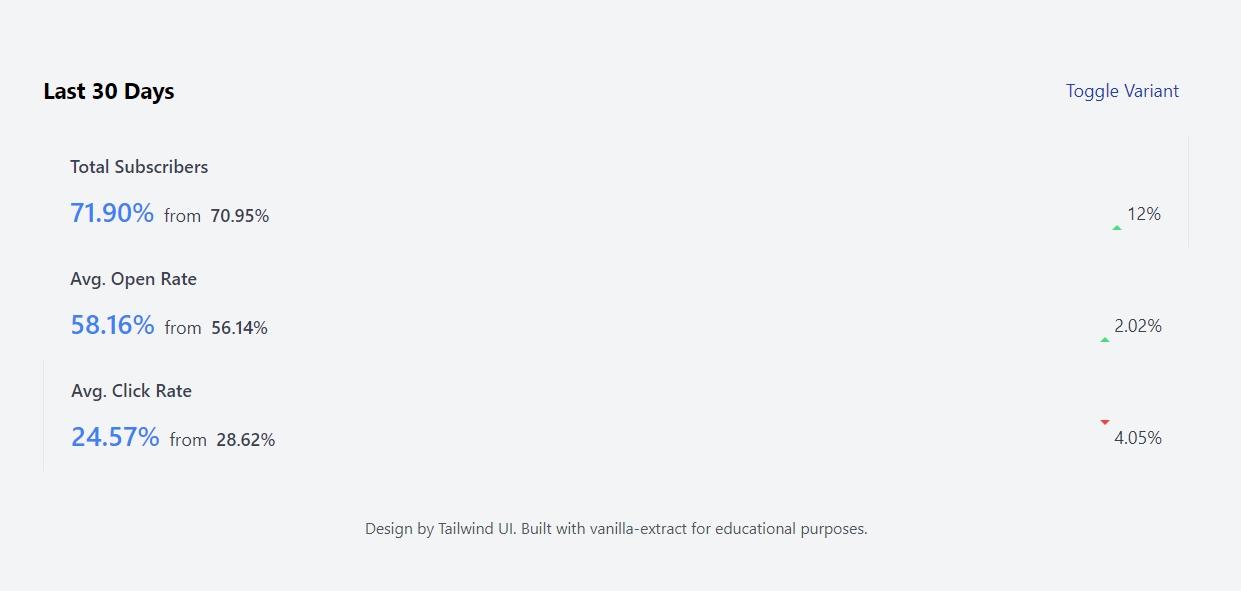
return ( <div> <span className={isPositive ? arrowUp : arrowDown} /> <span className={s({ marginLeft: `xs` })}>{Math.abs(percentage)}%</span> </div> )}The percentages should now have a green up and a red down arrow beside them (but still slightly misaligned).
Your browser preview should now look like this:
And that’s a wrap for the Sprinkles section of this tutorial. Everything you learned so far will be enough to build out your small blog to really large company websites. And as promised, read below the pro tip about making your own <Box> component. This is the primary way of using Sprinkles for me.
Pro Tip: Your own Box component
So, what’s a <Box> component? It’s a low-level component for binding your theme-based styles to an element. You can apply CSS properties of your design system through props to this <Box> component. You might have seen this in e.g. Chakra UI (opens in a new tab). Here’s an example usage:
import Box from "./box"
export default function Component() {  return (    <Box px="4" fontSize="lg">      Hello World    </Box>  )}
You get the type safety of Sprinkles with an (in my eyes) better developer experience as props on a React component are more concise than constantly using sprinkles. You can also use this <Box> component as the fundamental building block of your other React components. This very same <Collapsible> component this content is currently rendered in, is made out of <Box> components. Here’s the actual source code:
import * as React from "react"import { Box } from "../primitives"import { detailsStyle, summaryStyle } from "./collapsible.css"
export const Collapsible = ({ summary, children }) => (  <Box    as="details"    px={[`4`, null, `6`]}    py="4"    borderRadius="lg"    className={detailsStyle}  >    <Box as="summary" className={summaryStyle}>      {summary}    </Box>    {children}  </Box>)
So how can you make one of your own? Luckily a community member of vanilla-extract created Dessert Box (opens in a new tab). (Side note, don’t you also get hungry hearing all those food terms?)
Install the dependency:
npm install @dessert-box/reactAfter you created your sprinkles function (as shown above) you can create your <Box> component. In a new file, do the following:
import { createBox } from "@dessert-box/react"import { sprinkles } from "./sprinkles.css"
const { Box } = createBox({ atoms: sprinkles })
export default Box
And et voilà, you have your own Sprinkles-powered <Box> component. Read the Dessert Box Readme (opens in a new tab) for more information.
Ok, hang on with me. This is the last section of this tutorial! You’ll now learn more about vanilla-extract’s Recipes package. Similar to Sprinkles this is an additional package that you can install and it’s not part of the core of vanilla-extract.
Recipes (opens in a new tab) allows you to create multi-variant styles and the authors were heavily inspired by Stitches (opens in a new tab). It also reminds me a bit of Chakra UI’s component style (opens in a new tab) API.
Basically, the power of such a multi-variant API is that you can have even tighter control over how your design system is used for components while giving consumers of said components a really easy way to build with them. Since you’ve read the section about style and styleVariants I’d make this comparison: Recipes is similar to using styleVariants with base styles and a set of variants.
Here’s a usage example of a button recipe:
import { button } from "./recipes.css"
export const Component = () => (  <button    className={button({      colorScheme: `primary`,      size: `large`,      shape: `round`,    })}  >    Hello World  </button>)
And then behind the scenes the colorScheme can modify the background and border-color, the size can modify the font-size and padding, and shape can modify if the button is has a border-radius or not. It feels like e.g. using a <Button> component from a pre-built UI kit.
You can use Sprinkles and Recipes together, you’ll see in just a bit how. But you’ll need to look out for at least two things when combining them:
- You can easily generate massive amount of CSS classes as Sprinkles’
conditionsand Recipes are not optimized for each other yet. This will hurt both build & frontend performance. - It can get confusing when you use both of them without a system that tells you when & where to use which (they are different design paradigms after all).
I’d advise you to choose one of them (e.g. it makes more sense to you, your team likes it more, you used Tailwind/Stitches in the past, etc.) and then stick with that. This way you can’t run into the above mentioned problems.
Of course, if you absolutely know what you’re doing, take this advice with a grain of salt. But I think that the best advice for most folks is to choose either Sprinkles or Recipes and then stick with it.
Create a new file called recipes.css.ts inside src/styles, add the imports, and your first recipe:
import { recipe } from "@vanilla-extract/recipes"import { sprinkles } from "./sprinkles.css"import { vars } from "./themes.css"
export const stats = recipe({ base: {}, variants: {}, // compoundVariants: {}, defaultVariants: {},})base: The styling that is applied to every variant.variants: A map of valid CSS property names. Each property then has a map of variant names and their respective CSS styles.compoundVariants: Apply styles when multiple variants are set.defaultVariants: For each CSS property (defined invariants) you can define a default variant here.
The stats recipe is supposed to be used later in the <Stats> component on the <section> element. So it wraps all <StatsItem>. I needs to change its color and background. The names for the two variants you’ll implement are default and invert. Update the stats recipe to account for that:
import { recipe } from "@vanilla-extract/recipes"import { sprinkles } from "./sprinkles.css"import { vars } from "./themes.css"
export const stats = recipe({  base: {},  variants: {    color: {      default: {},      invert: {},    },    background: {      default: {},      invert: {},    },  },  defaultVariants: {    background: `default`,    color: `default`,  },})
You should get TypeScript autocompletion while filling out the defaultVariants map. vanilla-extract is smart enough to know what you wrote in variants.
As you have seen in other APIs already, you can use the other styling APIs to add styles to a recipe. A simple style object will do it, but you can also use style or sprinkles. Add the following styles:
import { recipe } from "@vanilla-extract/recipes"import { sprinkles } from "./sprinkles.css"import { vars } from "./themes.css"
export const stats = recipe({  base: sprinkles({    borderRadius: `md`,    boxShadow: `md`,    display: `flex`,    justifyContent: `space-between`,    flexDirection: [`column`, `column`, `row`],  }),  variants: {    color: {      default: {        color: vars.colors.body,      },      invert: sprinkles({ color: { light: `blue200`, dark: `blue200` } }),    },    background: {      default: sprinkles({ background: { light: `white`, dark: `gray900` } }),      invert: sprinkles({        background: { light: `blue600`, dark: `blue900` },      }),    },  },  defaultVariants: {    background: `default`,    color: `default`,  },})
Since you already defined a Sprinkles function, you can then also use it here. But keep in mind that what you see here can also be achieved with using vars and style functions.
As a last step, you’ll also define a trend recipe, to be used in the <Trend> component. The interesting piece in this is that no CSS styles for the invert variant of background are set (invertUp and invertDown). Because in that variant, the trend percentage (green up, red down) shouldn’t have a background. And as you’ll also see in the next step, the variant names will be computed in the <Trend> component.
Here’s the complete recipes.css.ts file:
import { recipe } from "@vanilla-extract/recipes"import { sprinkles } from "./sprinkles.css"import { vars } from "./themes.css"
export const stats = recipe({  base: sprinkles({    borderRadius: `md`,    boxShadow: `md`,    display: `flex`,    justifyContent: `space-between`,    flexDirection: [`column`, `column`, `row`],  }),  variants: {    color: {      default: {        color: vars.colors.body,      },      invert: sprinkles({ color: { light: `blue200`, dark: `blue200` } }),    },    background: {      default: sprinkles({ background: { light: `white`, dark: `gray900` } }),      invert: sprinkles({        background: { light: `blue600`, dark: `blue900` },      }),    },  },  defaultVariants: {    background: `default`,    color: `default`,  },})
export const trend = recipe({ base: sprinkles({ display: `flex`, alignItems: `center`, borderRadius: `md`, px: `xs`, fontSize: `xs`, fontWeight: 500, }), variants: { background: { defaultUp: sprinkles({ background: { light: `green100`, dark: `green900` }, }), defaultDown: sprinkles({ background: { light: `red100`, dark: `red900` }, }), invertUp: {}, invertDown: {}, }, color: { defaultUp: sprinkles({ color: { light: `green600`, dark: `green100` } }), defaultDown: sprinkles({ color: { light: `red600`, dark: `red100` } }), invertUp: sprinkles({ color: { light: `green100`, dark: `green200` } }), invertDown: sprinkles({ color: { light: `red100`, dark: `red200` } }), }, },})Switch to the src/components/stats.tsx file and add your stats and trend recipes as imports:
import * as React from "react"import { stats, trend } from "../styles/recipes.css"import { sprinkles as s } from "../styles/sprinkles.css"import { wrapper, toValue, arrowUp, arrowDown } from "./stats.css"
// Rest of file...
When using the recipe functions, the arguments are the CSS properties you defined as the top-level keys in the variants object. You then can choose the specific variant (with IntelliSense of course).
Edit the <Stats> component to use the stats recipe and use the variant prop for each value:
// Imports
export const Stats: React.FC<React.PropsWithChildren<IStatsProps>> = ({  children,  variant = `default`,}) => (  <StatsContext.Provider value={variant}>    <section className={stats({ background: variant, color: variant })}>      {children}    </section>  </StatsContext.Provider>)
// Rest of file...
Change the <Trend> component to use the trend recipe:
// Imports
export const Trend: React.FC<{ percentage: number }> = ({ percentage }) => {  const variant = React.useContext(StatsContext)  const isPositive = Math.sign(percentage) === 1  const variantPostfix = isPositive ? `Up` : `Down`
  return (    <div      className={trend({        background: `${variant}${variantPostfix}`,        color: `${variant}${variantPostfix}`,      })}    >      <span className={isPositive ? arrowUp : arrowDown} />      <span className={s({ marginLeft: `xs` })}>{Math.abs(percentage)}%</span>    </div>  )}
// Rest of file...
And that’s a wrap! Congrats, you now completely styled the tutorial app 🎉 Give the “Toggle Variant” button a try and switch between light and dark mode (How to emulate prefers-color-scheme in DevTools (opens in a new tab)).
Your app should now look the same as in the video at the beginning of this blog post. Stretch your legs or grab a drink, you earned it. Read on to see a summary and learn where to go from here.
While building this Tailwind UI component you learned to use the most important vanilla-extract APIs.
At the beginning you used globalStyle to add a CSS reset for the whole app. The globalStyle API has restrictions though, you can’t use complex selectors or pseudo selectors. globalStyle will also be helpful for you in the future when you want to reference other scoped class names, e.g. .scopedClassName > a.
In the next step you learned a ton about theming in vanilla-extract. While you can just use createTheme, in this guide you learned to create a theme contract with createThemeContract first. This sets you up nicely for when your application grows and you need additional themes. This theme contract ensured that your light and dark mode themes had the exact same keys. It also exposed a vars variable that you can use throughout your vanilla-extract stylesheets.
Really the core API of vanilla-extract is style (and maybe by extension styleVariants). In good old “CSS Modules” fashion you created locally scoped class names, imported them, and applied them to className. You learned how to use the mapping function of styleVariants to quickly generate variants of a specific style. After that section you could theoretically already have stopped reading because with style and styleVariants you can build 100% of your app (but luckily you kept on reading).
After learning all about the basics of vanilla-extract, the first external package on the list was Sprinkles. With it you built our your own version of Tailwind really. You learned how to define properties, and that there are conditions you can add. Lastly the section also explained how to set up media queries for your utility classes.
Last but not least, you got introduced to Recipes. Another external package from the authors of vanilla-extract. It’s API is heavily influenced by Stitches and allows you to create multi-variant styles. I pointed out that in my opinion you should either use Sprinkles or Recipes in your app, not really both of them together.
Believe it or not, but I still do have ideas for other blog posts about vanilla-extract. You can do so many cool things with it! I’ll link them below when I have written them. In the meantime, I can highly recommend checking out the vanilla-extract docs (opens in a new tab) as they have more examples for smaller use cases I couldn’t cover here.
If you’re curious how I use vanilla-extract in production, you can check out my portfolio (opens in a new tab) or tmdb.lekoarts.de (opens in a new tab). I migrated my site from Chakra UI to vanilla-extract (PR on GitHub (opens in a new tab)), resulting in better site performance!